1.) How does your product use or challenge conventions and how does it represent social groups or issues?
When
creating my magazine, I wanted the reader to feel a sense of ease when reading.
To do this, I made sure the design was simple, but still unique to shows off my
design skills. The magazine should inspire the readers to go out an
experiment with photography to further their knowledge.
To start,
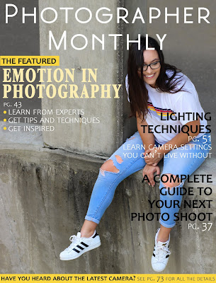
to create my cover I used an image that expresses a very uplifting emotion. By
doing this the reader will feel a similar emotion when going into the magazine.
The image has a plain background allowing the model to be the main focus of the
cover. In Photoshop, I added a brightness filter to the model helping her stand
out even more. I used the yellow from the model’s t-shirt as the color theme
for this issue of the magazine. This helps her outfit pop as well. Yellow
exhibits an energetic emotion to the viewers adding to the bright emotion of
the magazine.
To create
the layout of the cover, I was inspired by Amateur Photographer and Digital
Photo Pro. Their layouts are very similar in that they have a color theme,
multiple different fonts, and a similar layout of subheadings. For the main
subheading, I used a bolder font with a darker color to make that one stand out
over the others. I made the smaller subheadings black, with a less unique font
so they are still noticeable, but do not become the main focus. I laid out the
subheadings so that they wrap around the model, but do not cover her up. For the
title, I decided to keep it simple with a professional style.
For the
table of contents, I used the same color theme as the cover. By keeping a
cohesive theme throughout the magazine, it makes it look more professional. If
there were more issues of my magazine, I would do the same thing, by having a specific
color theme for each issue. For the title, “Contents”, I kept the same style and
font as the title of the magazine on the cover. I created four article categories,
and each has 2-4 featured articles on the table of contents page. I used three different
fonts for each featured article summary, which includes the page number, article
title, and summary. Doing this makes it easier for the readers to read the
description and differentiate between each part. I also used the same front for
the numbers on the images as the page numbers with the article descriptions.
For the
layout, I wanted to keep it simple, so I kept all the text to one side and the
images to the other. This makes it easier for the reader to look at the page
without getting overwhelmed. Originally,
I had six images on the page, but it looked to crowded, so I reduced it down to
three. Each image has bright lighting and exhibit positive feelings that are
then added to the positive emotion of the whole magazine.
For the article pages, I used a cohesive theme as well, but not with yellow. I chose to use a different
color because this the main featured article. I used blue because many of the
images on the two pages contain blue. Blue also expression calm emotions. In all
the images I used, the model has a specific emotion to connect with the article’s
topic of emotion on photography and to show off my photography skills. I added
dots to the pages, so they didn’t look so white and bare. By doing this, it adds a unique, artsy
style to the pages.
For the
article title, I used a more unique, stylish font then the other fonts used
throughout the magazine. In Photoshop, I added a drop shadow to help to pop off
the page. The font of the article text is very simple and easy to read. Using a
simple easy to read font helps the reader read with ease. For the subheads, I made
the font larger and bolder making it stand out. I made one of the quotes from
the photographer I interview into a pull quote. This puts importance on the quote.
I used a very dark, bold font to make it stand out.
Throughout
the entire magazine, I made sure I used a lot of images to show off the photography
skills, as well as my editing skills. For all the images, I did basic edits to
clean them up, along with some more advanced edits. For example, the cover image,
I made the model brighter than the background. For the last image on the second
article page, I edited the colors to add a blue hue and adjusted the
contrast. Since the entire magazine was made in Photoshop, it also shows my Photoshop
and design skills. I used many photography magazines to help inspire me while
making my magazine.
This
magazine is geared towards people who are interested in learning about photography
or improving their skills. I think there are some more professional aspects the
magazine that require some basic knowledge when reader, but I think anyone
would have a fairly easy time understanding the content. Photography can be expensive to do, so I think people
who want to pursue what they are reading about will have to have money they can
spend on photography gear. There isn't a specific gender or education level
that the magazine is geared towards, it is just for anyone who is interested in
photography.


